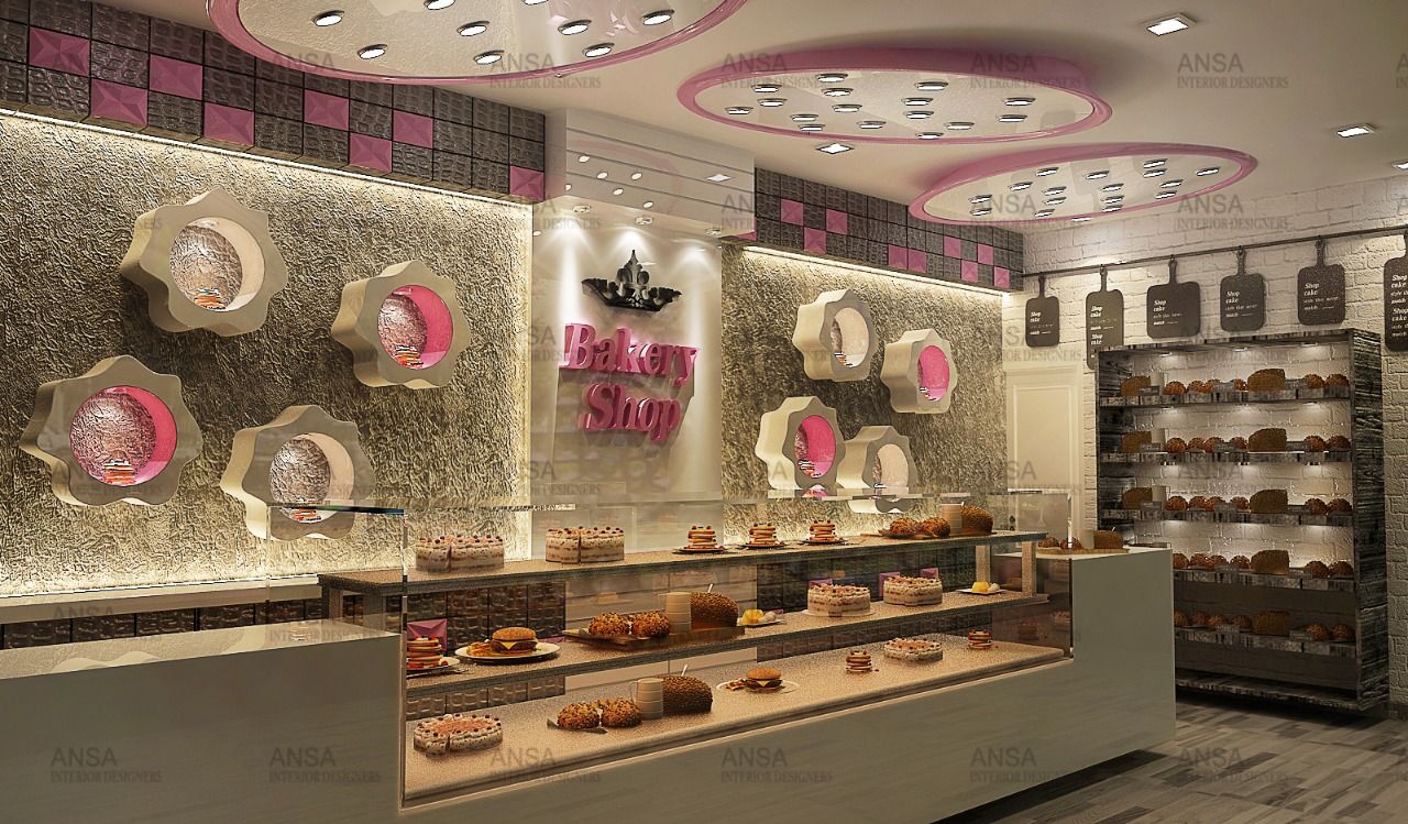
In this post, we discuss the bakery shop interior design project we completed in Pitampura Delhi.
The success of bakery shop would depend on the quality of product and ambiance. The interiors of any bakery shop would add to the overall shopping experience, thereby attracting more customers.
Our surroundings continuously send message to our brain and determine how we react.
To stand apart and stay competent, you have to do things differently even if product is same. A well designed interior is your first marketing tactic to attract a customer.
Requirement For This Bakery Interior Design Project
The shop in Pitam Pura is a corner shop with hardly 250 sq. ft. area. The basic step was to understand the goal, the target audience and the type of customers. The seller wanted to sell puffs, pastries and patties, hence required show window to display party themes. The bakery did not have any cooking happening at the same place. It only required the re-heating equipment at that place. The short term plan was to sell bakery products and make a name in the market whereas long term plan was to enter into parties.
Bakery Interior Design: Our Design Philosophy
- The space for this bakery interior design has to be designed keeping proper movement space, and the theme desired.
- The outside facade was designed to look little European while the inside though simple had the fairy element.
- The choice of material, colour, lighting, graphics, signages, artwork, display units all revolved around the same themes. The cash counter was made just at the beginning and camouflaged with display counter and the heating counter.
- A few display units were created in the back with floral shapes to highlight special products launched. Pink and silver were infused with white to create the desired fantasy look.
- A small plasma was added to run their presentation of party themes and new experimental bakery products.
- The menu was hung on the front wall on a wrought iron bar in the form of boards that could be changed anytime.
- The bread counter at the end was made in an old ship wood to add the character.
- The show windows acted as display counter for party themes and new launches. Air curtain was provided to avoid air-conditioning loss.
- The brand name was infused in the design to add a recall value.
- The outer was done in dark brown colour with wrought iron corners and wrought iron lamp post to add a European character. The outer space was used for makeship sitting and demarcated by a green patch.
- The graphics of boxes to the menu card were designed on the same theme.
- The lighting played an essential part in highlighting the focal areas. Special focus was given to the changing natural light at the changing day timings before selecting the light fixtures.
- Music was integrated while the aroma of fresh baked food flowed to attract the attention.
The aim of making an enjoyable shopping experience while selecting and buying was taken care all the time.
For professional bakery shop interior design or commercial interior designing services in Delhi NCR & Srinagar, contact us!

